When Die Energiepioniere approached us, they already had something valuable: a mission-driven name and deep expertise in the energy sector. But their brand presence wasn’t keeping pace. The visual identity felt outdated, the website was barely functional, and across channels, there was no clear consistency. Their story, one of innovation, reliability, and renewable energy, wasn’t being told in a way that matched their ambition.
The challenge was clear: to give Die Energiepioniere a strong, modern identity that not only reflected their credibility but also positioned them as pioneers in shaping a sustainable energy future.
The risk? Creating yet another “green” energy brand that blends into the crowd, overloaded with clichés of leaves, solar panels, and generic eco-icons. Instead, we set out to design an identity that feels bold, modern, and deeply symbolic, while staying true to their values.
Here’s what we did for them:
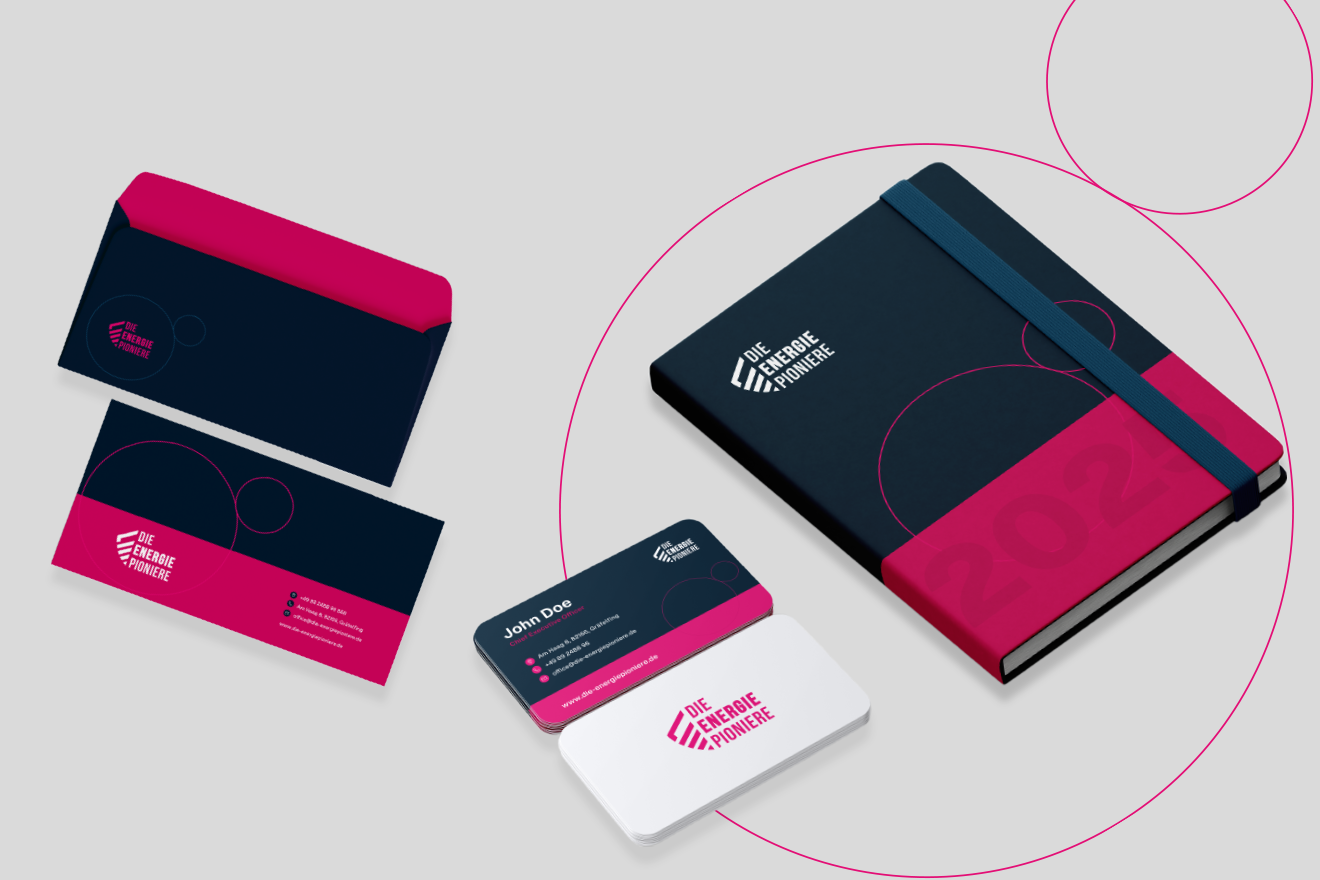
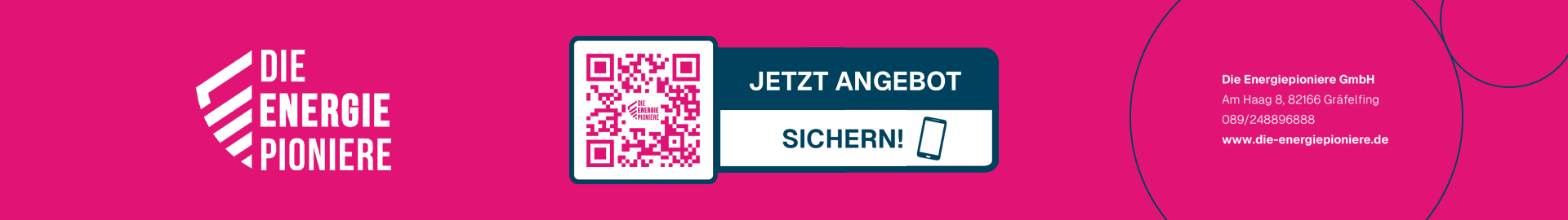
The result is:
A brand identity that finally lives up to the pioneering spirit of its name. Die Energiepioniere now stand with a renewed presence, consistent, modern, and recognizable. The new design doesn’t just look better; it communicates strength and vision, positioning them as a trustworthy guide in the energy transition. Their website now reflects their expertise with clarity and balance, turning visitors into informed partners.
Today, Die Energiepioniere have an identity as strong as their mission: forward-looking, harmonious, and built for long-term impact. What once was an outdated presence is now a powerful brand platform, one that radiates reliability and the promise of renewable energy.